4. Common Workflows
4.1. Selecting and loading a study
GTFlow supports various 4D-flow file formats: Dicom (classic and enhanced), Philips par/rec and xml/rec, and PCVipr. For auxiliary data sets also other file formats as Nifty or VTK are supported.
You can open a file selector with the ‘open from file’ and ‘open from directory’ buttons on the Start page, or with the ‘+’ button on the upper left corner of the Organize page.
Tip
DICOM
With the file selector select the DICOMDIR file for a DICOM study (if available), or a single .dcm file. GTFlow will examine all files at the selected location and open all .dcm files that belong to the same study. Alternatively, if you have a study in classic dicom format with .dcm files distributed in multiple directories, use the ‘open from directory’ feature and select the parent directory.
Tip
Philips PAR/REC
Select either the .par, .xml, or .rec file. GTFlow will search for the accompanying file in the same directory. You can also select multiple study files at once, provided they are in the same directory. GTFlow will then proceed to load all the studies in one go.
Tip
PCVIPR
Select the ‘pcvipr_header.txt’ file only. GTFlow will collect all accompanying files in the same directory.
GTFlow will keep data in memory as datasets, where a dataset is a 4-dimensional image data structure representing an image volume at different time points or cardiac phases. Both the slice and the time dimensions can be of size 1 if only 2D or 3D data is available.
When the selected files contain data of multiple datasets, the dataset selector window will pop up with all the datasets preselected. Proceed with ‘OK’ to load all datasets or change the selection to limit which datasets are loaded into memory.
Datasets loaded into memory are listed in the ‘DataSet Management’ box on the Organize page along with a thumbnail representation of the data. If the loaded datasets are part of a 4D flow study and GTFlow is able to detect the various velocity encoding directions, then the datasets loaded into memory will be used to populate the four components of the flow dataset: 1. the magnitude image 2. the PC image with through-plane velocity encoding 3. the PC image with horizontal in-plane velocity encoding 4. the PC image with vertical in-plane velocity encoding
Warning
Check that the individual datasets were correctly assigned and that the velocity-encoding values and the cardiac phase interval were correctly detected. If GTFlow cannot assign or detect any of these, you have to assign or fill in the values manually.
4.2. Flow Data Pre-Processing
Before analyzing flow, it is often necessary to pre-process the velocity field to remove noise, correct acquisition artifacts, or restrict analysis to a specific region. Pre-processing is performed on the Organize Page using the controls in the Velocity Field Mask and Flow Dataset panels on the right side of the page.
All active filters are applied in combination: only voxels that pass every active filter retain their original velocity values; all others are set to zero.
Tip
Pre-processing changes are non-destructive. The original raw data on disk is never modified. Filters can be enabled, disabled, or adjusted at any time.
4.2.1. Magnitude Image Intensity Threshold

Figure 4.1: Velocity field mask controls on the Organize Page.
Masks out voxels whose magnitude image intensity falls below a user-defined threshold. This effectively removes velocity values in regions without MRI signal (e.g., air, bone), where the phase data is pure noise.
Recommended use: Enable early in the workflow. Set the threshold just above the noise floor of the magnitude image — a value of 100–200 is a typical starting point for 4D flow datasets.
4.2.2. Velocity Magnitude Threshold
Masks out voxels whose velocity magnitude (speed) falls below a threshold. Useful for removing near-zero background velocities in stationary tissue.
Recommended use: Use with caution in vessels with low peak velocity, as slow-moving blood near the vessel wall may be inadvertently masked.
4.2.3. Segmentation Mask
Applies a binary segmentation label as a mask to the velocity field. Two modes are available:
Direct mask — only voxels inside the label are retained.
Inverse mask — only voxels outside the label are retained (useful to zero out velocities inside the vessel after WSS analysis setup).
Recommended use: After creating a vessel segmentation on the Segment Page, apply the label as an inverse mask to ensure zero velocity outside the vessel boundary before computing WSS.
4.2.4. Crop (Region of Interest)
Restricts the velocity field to a rectangular sub-region. To define the crop area, press Ctrl + left mouse button and drag inside any viewer on the Organize Page — the drawn rectangle becomes the active main ROI mask. To remove it, double-click anywhere in the viewer. Cropping reduces memory usage and accelerates all downstream processing.
Recommended use: Always crop to the smallest region that contains all vessels of interest. This is especially important for large whole-body or whole-thorax acquisitions.
4.2.5. Linear Phase Correction (Background Phase Offset Correction)

Figure 4.2: Phase correction settings.
Corrects systematic velocity offsets caused by eddy currents or gradient non-linearities during acquisition. A first-order (linear) polynomial is fitted to the velocity values in static tissue voxels and subtracted from the entire velocity field.
Recommended use: Apply when net flow measurements show non-zero values in vessels that should balance (e.g., ascending and descending aorta in the absence of shunts), or when a visible constant offset is present in magnitude-zero regions.
4.2.6. Aliasing Correction (Phase Unwrapping)

Figure 4.3: Aliasing correction settings.
Corrects velocity aliasing that occurs when the true velocity exceeds the velocity encoding (VENC) set during acquisition. The algorithm detects and unwraps aliased voxels by comparing them to their neighbours.
Recommended use: Apply when peak velocities visually appear inverted (bright becomes dark and vice versa in the phase image) or when flow measurements show unexpectedly large negative spikes.
4.3. Vessel Segmentation
This chapter describes the segmentation of 3D images. A segmentation assigns to each image voxel a label determining the material or region the voxel belongs to, e.g. tissue or the aorta. Every label belongs to a mask, which basically specifies the size of the segmentation data. You can create 3D and 4D masks, where 3D masks have one segmentation volume identical for all time points. 4D masks on the other hand have one independent segmentation volume per time point. A typical vessel segmentation will use one 3D mask, that has one or two labels. A segmentation is the prerequisite for vessel surface model generation. The segmentation process comprises the following basic steps:
Data preparation.
Creation of a mask.
Creation of a label (one label is automatically generated when a mask is created).
Application of one or more commands to assign voxels to a label.
4.3.1. Tutorial
Load the DataSet(s) you want to segment into GTFlow. Throughout this tutorial the GTFlow Demo DataSet is used.
Prepare source data.
High-quality source data is key to good segmentation results. It is recommended to prepare the source data prior to segmentation as far as possible: For 4D flow data, consider creating a (weighted) velocity magnitude map and use it as segmentation source. Also, applying a smoothing filter can improve the quality of a subsequent segmentation. Finally, large datasets should be cropped to the relevant region to speed up segmentation.
For preparation of the GTFlow Demo DataSet, a weighted velocity magnitude map is created. It will be used as source data for segmentation.
Switch to the Segment page and create a new 3D mask. When creating a mask, a DataSet must be selected. This DataSet is used to define the data size of the mask. Only DataSets of the exact same size can be used as segmentation source data. The selected DataSet is automatically set as current segmentation source data. A new label called ‘Label 1’ is created automatically. All voxels that get assigned to this label will be visualized in blue. The label color and name can be changed any time.
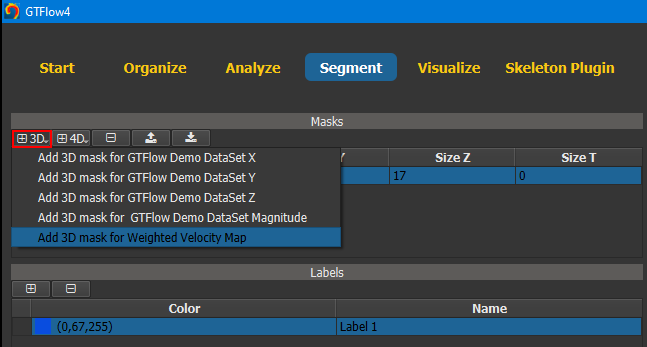
Figure 4.4: Creating a segmentation mask using a data size template.
Add a command to the label. Commands ‘belong’ to a label and can be used to select voxels from the current source data. Selected voxels will be assigned to the command’s label.
The following commands exist:
Threshold 3D: Adds all voxels that lie within a range of values.
Region Grow 2D/3D: Adds all voxels that are connected to a seed voxel and lie within a range of values.
Contour 2D: Adds all pixels that lie within a user drawn 2D contour.
Region Filter 3D: Removes all voxels that are not connected to a seed voxel.
Manual Edit 2D/3D: Adds or removes manually selected voxels.
More information can be found on the command’s ‘Help’ tab.
All segmentation commands support Undo/Redo.
To start segmentizing the aorta of the GTFlow Demo DataSet we add the Region Grow 3D command. This is a powerful command that allows us not only to select multiple seed points, but also to manually disconnect voxels that constitue ‘bridges’ into regions outside of the vessel. After adding the command, we left-click a voxel inside the aorta. This selects the voxel as the first seed point and also initializes the value range. Tweaking the value range a little bit - using the slider or inputs under the histogram - will result in a segmentation similar to the image below.
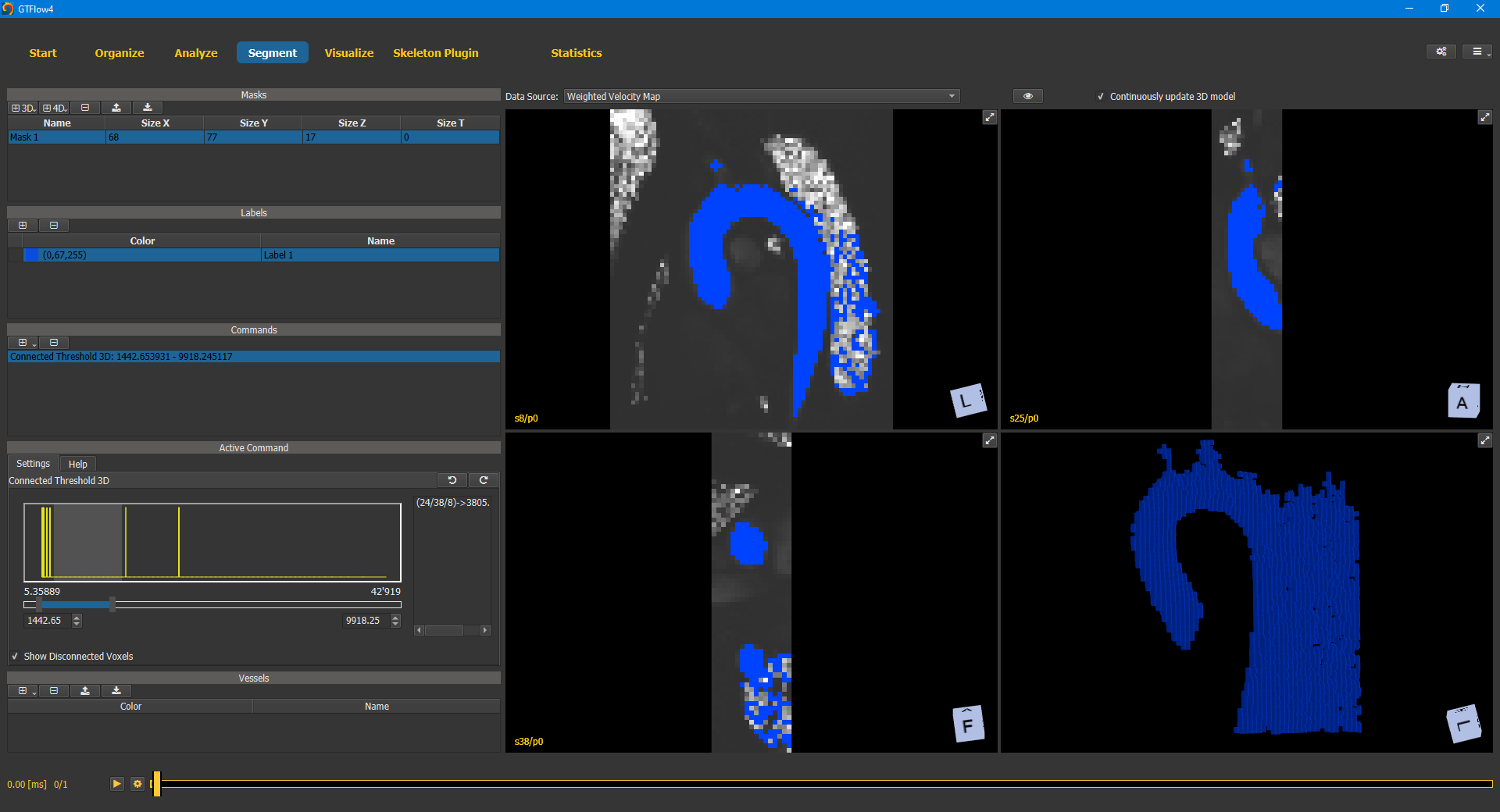
Figure 4.5: Region Grow 3D segmentation command.
While the aorta is already recognizable, there are also a lot of extraneous voxels selected. The best way to get rid of them, is to manually disconnect them. This can be done in any of the 2D or 3D viewers. In this tutorial, we will disconnect the voxels in the 3D viewer (the one in the lower right corner). It is much faster than doing it slice-by-slice in a 2D viewer, but also more error-prone as one can easily disconnect voxels that actually belong to the aorta. First we maximize the 3D viewer by clicking the expand button in its upper right corner. The three 2D viewers now disappear and the 3D viewer takes the entire viewer space. Moving the mouse in the viewer and holding down the CTRL key will show a little red circle. The size of the circle can be adjusted using the mouse wheel. Pushing the left mouse button (while still pressing CTRL key) will disconnect any voxel within the red circle. Other voxels that are now no longer connected to one of the seed voxels will be removed from the label immediately.
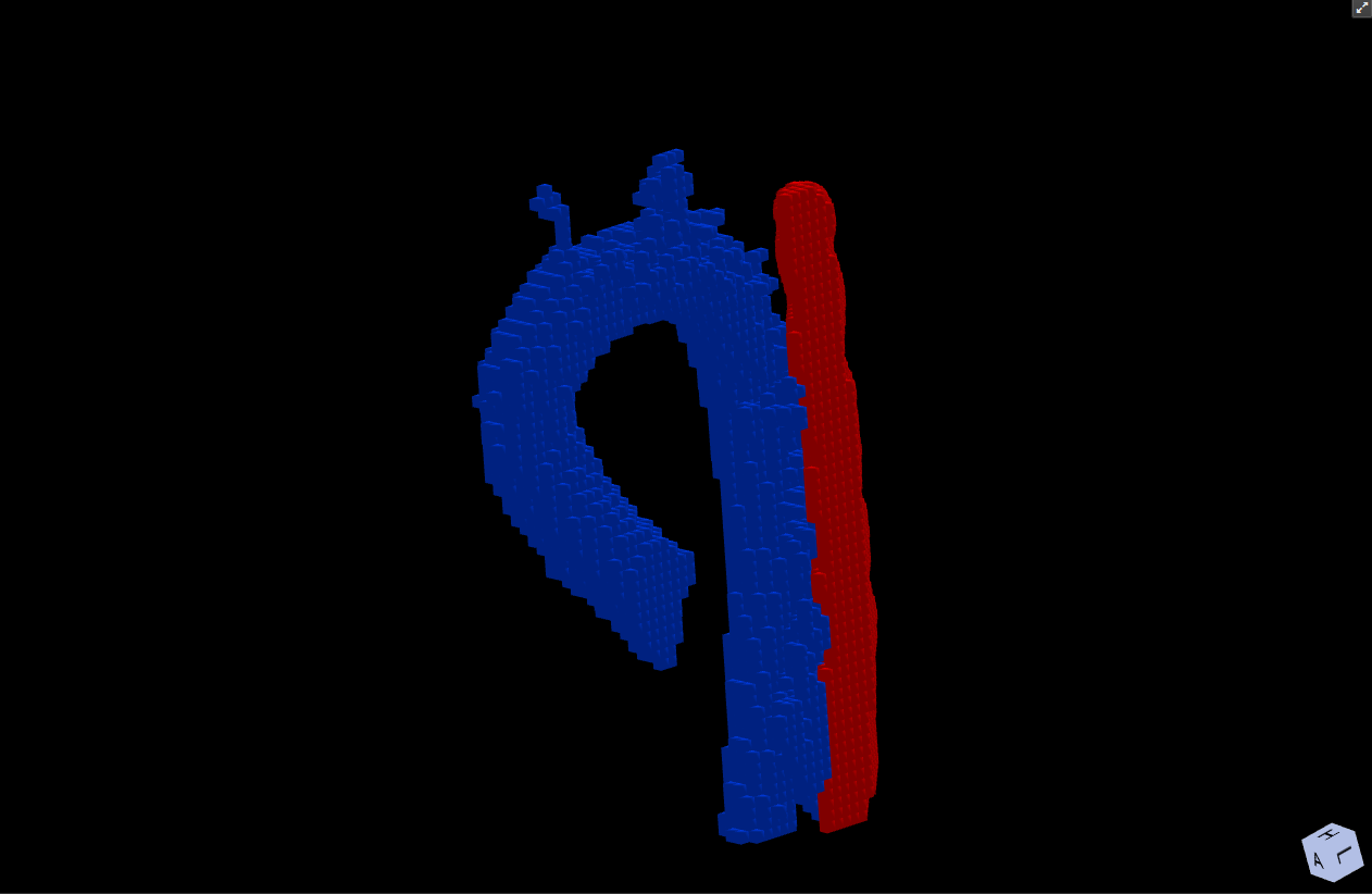
Figure 4.6: Manual editing of the segmentation mask with the “Disconnect” tool.
Now we can extend the value range some more again or left-click to set additional seeds to add more vessel voxels to the label. Usually the two basic steps ‘extend value range’ and ‘disconnect voxels’ have to be iterated several times. Keep in mind that the Region Grow command is not meant to give you a perfect segmentation result, but rather a rough first approximation that requires further manual modification. After the Region Grow command, the label should contain all positive voxels and as few extraneous voxels as possible.
To further improve the segmentation, we add the Manual Edit 2D/3D command. Adding a new command automatically activates it. Moving the mouse over a viewer will show a red circle again (no need to press CTRL this time). Left-click of the mouse will affect all voxels within the circle. The command can be used to either add voxels to the label or erase voxels from it. The current mode can be set on the command’s Settings tab. Again we operate in the 3D viewer first, which allows us to do the rough work efficiently.
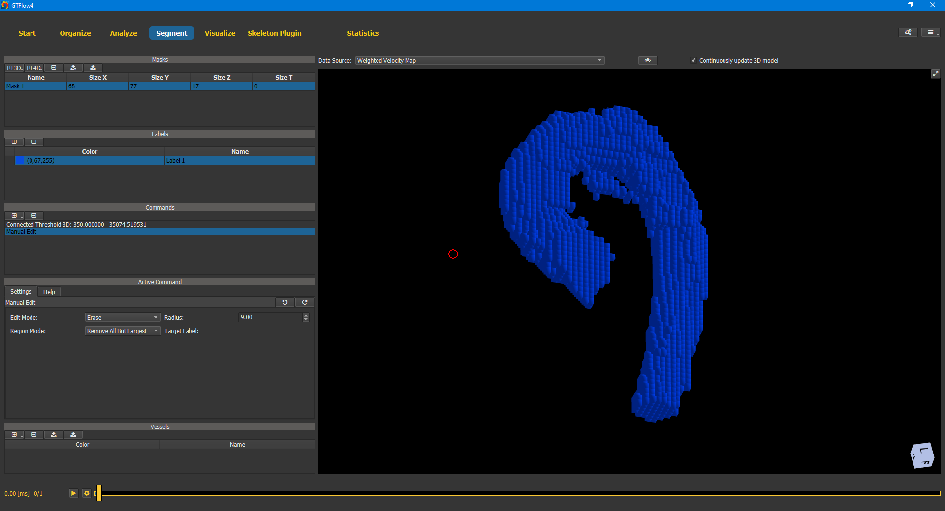
Figure 4.7: Manual editing of the segmentation mask with the “Edit 2d/3d” tool.
Afterwards the finishing touches can be done in the 2D viewers. Use the up and down arrow keys to navigate through the slices where you can erase or add voxels at maximum precision.
4.4. Segmentation using an Additional Dataset
Segmentation using the 4D-flow dataset is challenging, as 4D-flow datasets usually lack both a good spatial resolution and a good tissue contrast. GTFlow allows to use a dataset from an additional acquisition to perform the segmentation, such as for example an MR angiography acquisition. Note that the additional dataset does not need to have the same orientation, nor the same spatial and temporal resolution as the 4D-flow dataset. The patient position however has to remain identical in the two acquisition. Note that patient motion or different breath hold position might undermine this requirement.
4.4.1. Tutorial
For this tutorial, use the built-in sample dataset which also includes an additional angiographic acquisition. Access it from the Start page.
Preview the angiographic dataset in the preview viewer. Note that the data has only a single time point and differs from the 4D-flow data both in orientation and in spatial resolution.
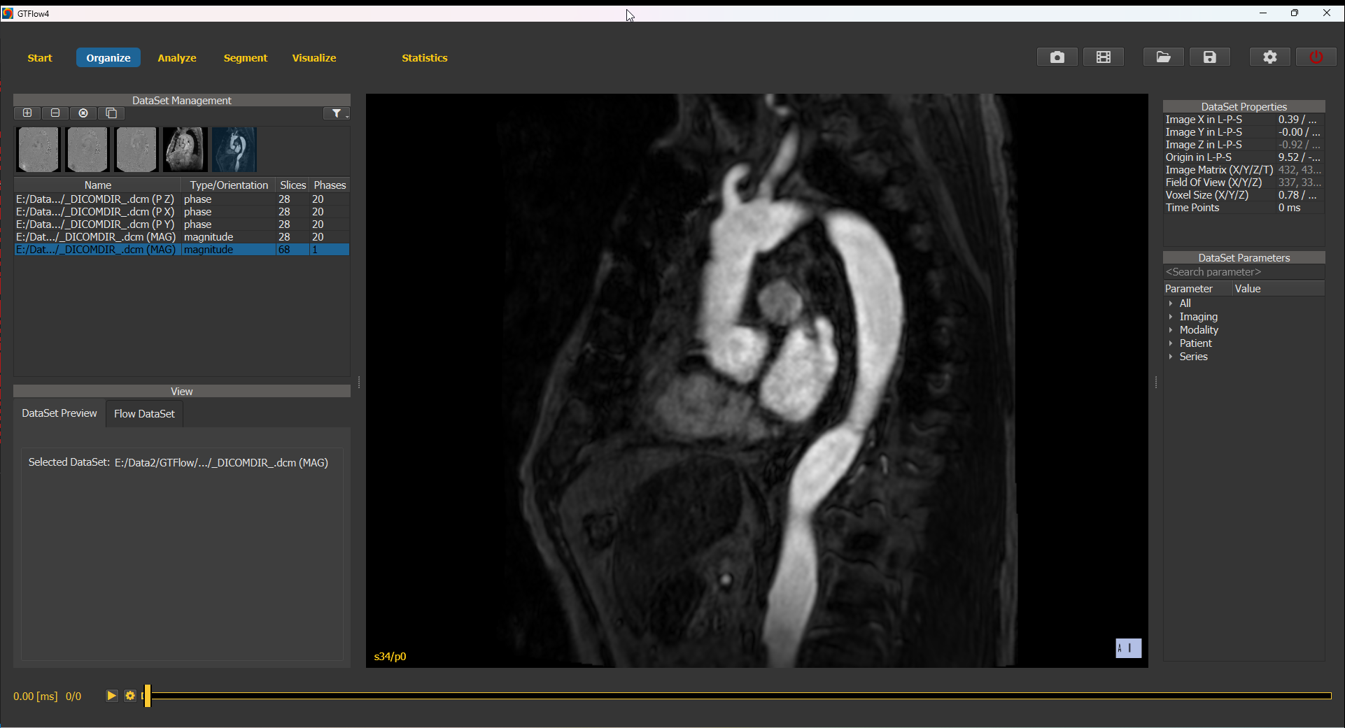
Figure 4.8: Angiographic dataset in the built-in large sample dataset.
2D Contour Segmentation
To use the angiographic dataset for contour drawing, switch to the Analyze page and select the “3WP” layout mode. The two left-most viewers have the angiographic dataset selected as source data set, while the right-most viewer has the magnitude image of the 4D-flow dataset selected.
As usual, place a reslice stack such as to obtain a cross-section image perpendicular to the vessel of interest. Lock the view of the right-most viewer to its neighbouring viewer by selecting the button. The 4D-flow dataset will be resampled to the same orientation as the angiographic dataset. Draw a contour on the angiographic dataset and copy it to all time points. Inspect the position of the contour in all heart phases of the 4D-flow dataset. Use ALT + left mouse button to manually shift the contour where required.
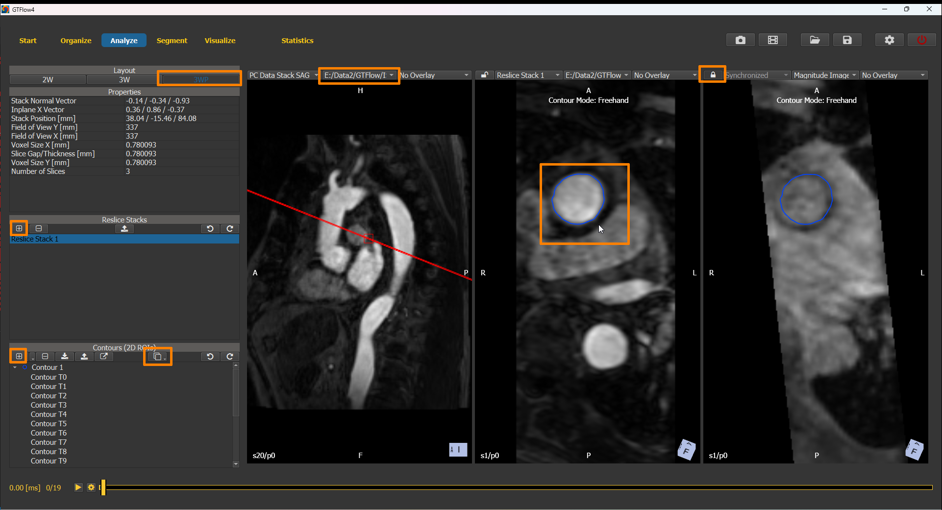
Figure 4.9: Drawing contours on the angiographic dataset.
3D Vessel Segmentation
To use the angiographic dataset for vessel segmentation, switch to the Segment page. Create a new segmentation mask using the dimensions of the angiographic dataset and set the angiographic dataset as source dataset. Proceed segmenting the vessel structure using the segmentation commands (see previous chapter). From the resulting mask generate a vessel object.
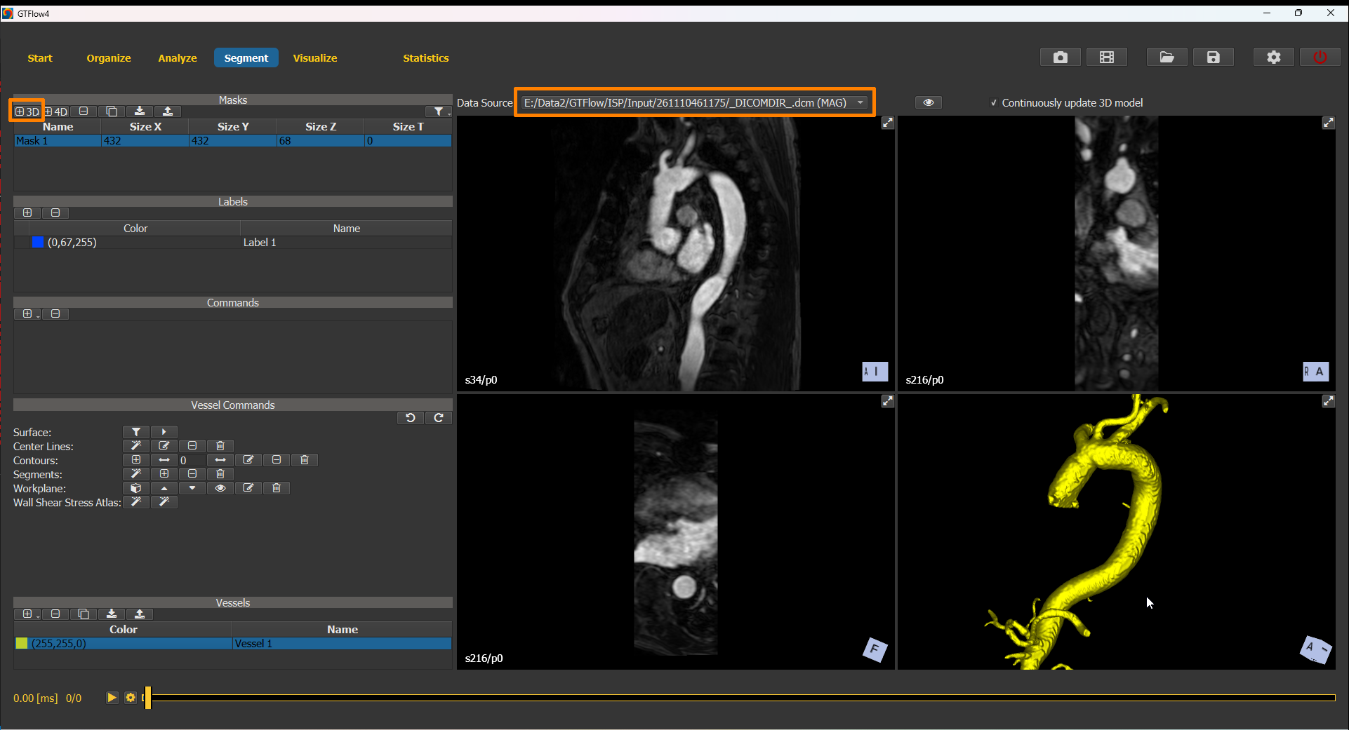
Figure 4.10: Creating a vessel object by segmenting the angiographic dataset.
4.5. Working with the Vessel Object
Vessels are spatial objects in the patient coordinate space, whose geometry is described by a triangle surface mesh. As their name suggests, they are designed for blood vessel representation. Vessel objects can be imported from STL files or created from a segmentation label on the Segment page.
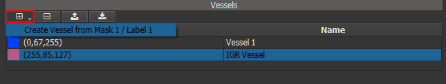
Figure 4.11: Vessel object controls and list.
After a vessel has been created it can be further edited using a variety of commands. Those commands can be accessed either on the Segment page or within a vessel node on the Visualize page.
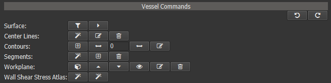
Figure 4.12: Vessel object commands.
4.5.1. Surface Commands
GTFlow provides basic surface manipulation commands to improve the surface mesh. More sophisticated surface modelling is outside the scope of this application. Please use a dedicated surface modelling software if required and (re-) import the final mesh.
4.5.2. Center Line Commands
Center lines are an optional component of vessel objects. They are required for the creation of vessel-bound contour objects and segments as well as for Pulse Wave analysis. To create the center line, press the button. In the 3D viewer pick one or more (for branches) source points of the center line, press ‘t’ and pick a target point. Press the middle mouse button to finish input and wait until the center line has been calculated.
4.5.3. Contour Commands
Vessels can host special contour objects. These contours are perpendicular to the vessel’s center line and their outline follows closely the vessel surface. Vessel-bound contours can be used to create vessel segments, but in any other aspect are just regular contours. I.e. they can be inspected, modified, deleted on the Analyze page and used as statistics source. Creation is simple: press the button and pick one or more points on the center line. Then press the middle mouse button to finish input.
4.5.4. Segment Commands
Vessels can be divided into multiple independent parts, so called segments. Each segment’s start and end is defined by a vessel-bound contour object. Segments are useful as statistics source and a requirement for Pulse Wave analysis. Use the automatic creation mode to create segments between all contours. Use the manual mode to pick the two start and end contours in the 3D viewer.
4.5.5. Statistical Analysis
Just like their 2D counterparts - the contour objects - vessels can be the source for statistical analysis of the velocity field. Open the Statistics page and activate the ‘Vessel Statistics’ tab. Choose category ‘Velocity’ for data of the velocity field or one of the loaded DataSets.
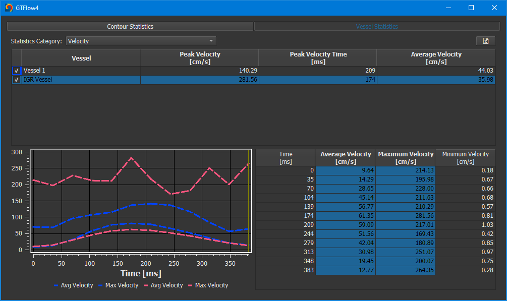
Figure 4.13: Vessel segment statistics.
The table at the top has one row per vessel object. It shows extreme and average values over all time points. The table below shows time-resolved values for the vessel currently selected in the upper table. The data of each selected column will be plotted in the diagram to the left. To add data of another vessel to the diagram, tick the checkbox at the very left of its row in the upper table.
4.6. Assessing Wall Shear Stress
Wall Shear Stress (WSS) is the tangential force of the flowing blood on the surface of the blood vessel. The stress vector τ’ at a surface point P is described by the formula
τ' = µ[δvx'/δz' δvy'/δz' 0]
where the local coordinate system [x’ y’ z’] is chosen such that z’ aligns with the inward surface normal at P.
In GTFlow vessel objects are used to calculate and visualize Wall Shear Stress.
4.6.1. Calculation
Before WSS Calculation
create and pre-process the vessel object. Pay special attention to the surface quality, as imperfections like sharp edges will often result in incorrect WSS values.
setup and pre-process the Flow DataSet. If the vessel object was created from a segmentation label, you might consider applying the label as ‘Inverse Mask’ to the velocity field. This way ensuring the velocity field is all zero outside the vessel.
do a visual plausibility check of the data. Switch to the Visualize page and add a scene node for the vessel. In the ‘Node Properties -> General’ change Mesh Style to ‘Wireframe’ and turn on ‘Show Normals’ to check the mesh quality. Set ‘Velocity Vectors’ to ‘Surface’ to check the velocity data. The displayed velocity vectors should be tangential to the vessel surface. Rework the segmentation label and recreate the vessel until the data is satisfactory.
The WSS calculation is done on Statistics page. Activate the ‘Vessel Statistics’ tab and select ‘Wall Shear Stress’ in the ‘Statistics Category’ dropdown.
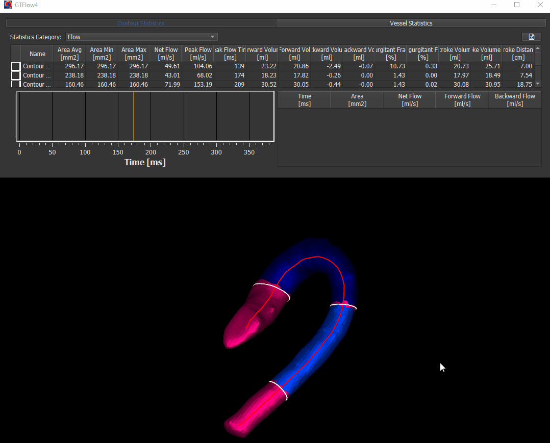
Figure 4.14: Calculating wall shear stress.
4.6.2. Visualization
Switch to the Visualize page and add a scene node for the vessel. The WSS visualization options can be found under ‘Node Properties -> Wall Shear Stress’.
Figure 4.15: Wall shear stress visualization.
4.6.3. Atlas Generation
Warning
Experimental Feature
In a first step an Idealized Geometry Representation (IGR) vessel must be created, that represents a cohort of ‘normal’ control vessels. To do this, load all control vessels into GTFlow and calculate the WSS for all of them. Then click the left button of the ‘Wall Shear Stress Atlas’ row in the Vessel Command widget. On success a new vessel called ‘IGR vessel’ will be generated and automatically added to GTFlow. The generated IGR vessel will have WSS values, that were averaged from the interpolated values of all control vessels.
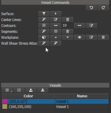
Figure 4.16: Creating an averaged vessel object.
Now a ‘Heat Map’ can be generated for one or more ‘test’ vessels by comparing their WSS values to those of the IGR vessel. First calculate the WSS for all ‘test’ vessels. Then select the IGR vessel in vessel list and click the right button of the ‘Wall Shear Stress Atlas’ row in the Vessel Command widget.
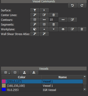
Figure 4.17: Calculating WSS deviation from the averaged vessel.
For visualization of the generated heat maps switch to the Visualize page and add a scene node for the vessel. The WSS visualization options can be found under ‘Node Properties -> Wall Shear Stress’.
Figure 4.18: Heat map visualization.
4.7. Particle Statistics
This chapter describes step by step a workflow to segment a vessel, generate pathline particles in vessel segments, and access the detailed particle statistics that GTFlow offers. This tutorial uses the built-in large sample dataset on the start page of GTFlow.
Figure 4.19: Particles statistics selecting the build-in sample dataset.
4.7.1. Masking the velocity field
On the organize page …
select the flow dataset tab,
enable the in-plane velocity overlay,
scroll with the time slider through the heart phases,
enable the velocity field mask as a threshold of the magnitude image to eliminate random velocity values in regions without signal.
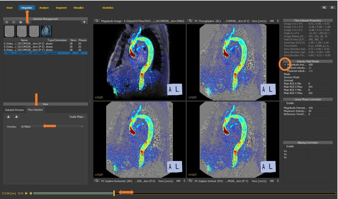
Figure 4.20: Particles statistics tutorial step 1.
4.7.2. Weighted velocity map
If no angio data is available, generate the weighted velocity map as a support image for segmentation. In this tutorial, we will use the angio data set available in the sample data.
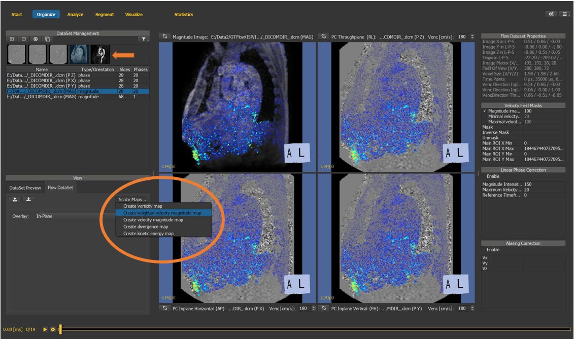
Figure 4.21: Particles statistics tutorial step 2.
4.7.3. Create a 3D segmentation mask
On the segment page, generate a new 3D (static) mask using the angio dataset as support data.
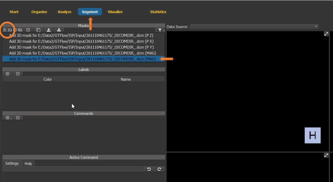
Figure 4.22: Particles statistics tutorial step 3.
4.7.4. Create a segmentation command
For this tutorial, the segmentation will consist of a single label, which is auto-generated. Create a new segmentation command, select the “Region Grow 3D” from the dropdown list.
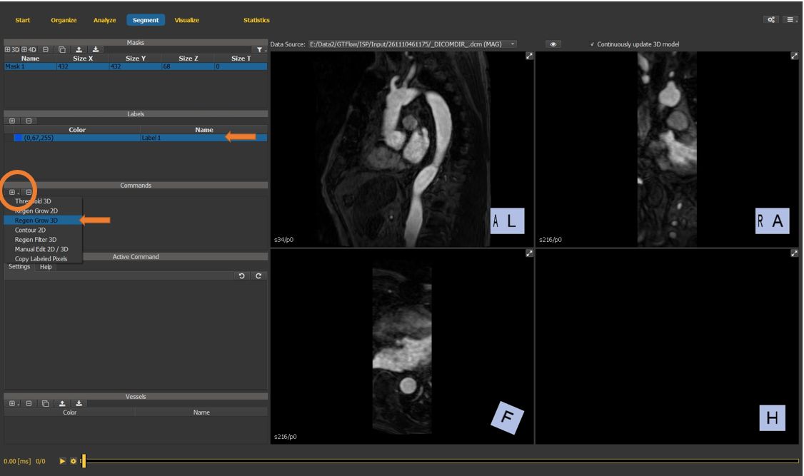
Figure 4.23: Particles statistics tutorial step 4.
4.7.5. Configure the segmentation command
Select the newly created command to see its properties in the active command window. Check the Help tab for command-specific usage instructions.
select a pixel inside the vessel as a seed point for the segmentation.
adjust the upper and lower segmentation thresholds to obtain a reasonable vessel segmentation mask.
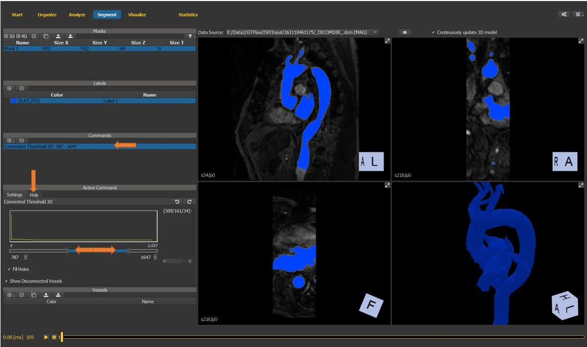
Figure 4.24: Particles statistics tutorial step 5.
4.7.6. Edit the segmentation mask
Use the maximize button to maximize the 3D mask window.
Holding the Ctrl-key, draw a separation at the level of the aortic valve to separate the aorta from the ventricular chamber.
Undo and redo functionality is available within a command.
Multiple commands can be applied sequentially.
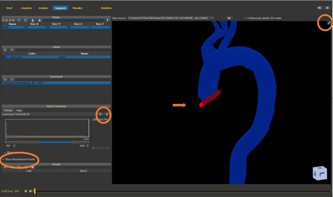
Figure 4.25: Particles statistics tutorial step 6.
4.7.7. Create a vessel surface mesh
Create a new vessel surface mesh using the previously generated voxel map as input.
Meshes can also be in- and exported as stl files.
To rotate the 3D view, hold the shift and ctrl key simultaneously, and click and drag the left mouse button inside the viewer window.
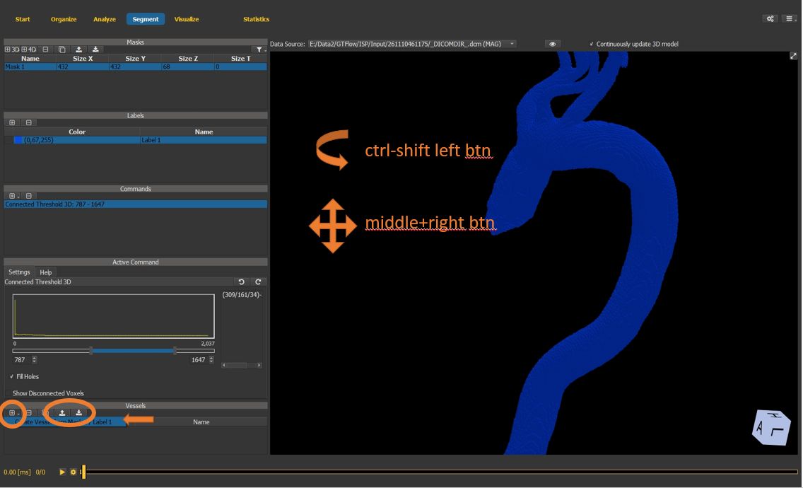
Figure 4.26: Particles statistics tutorial step 7.
4.7.8. Smooth and simplify surface mesh
Smooth and simplify the mesh using the buttons in the vessel commands window. Apply multiple times to obtain a smooth mesh.
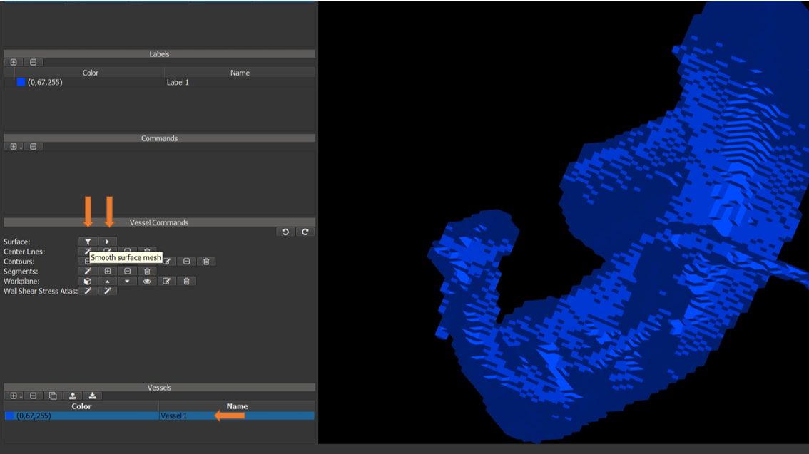
Figure 4.27: Particles statistics tutorial step 8.
4.7.9. Generate the vessel center-line
use the center line creation wizard button.
follow the instructions displayed in the window.
set the start point of the vessel center line.
press the key ‘t’.
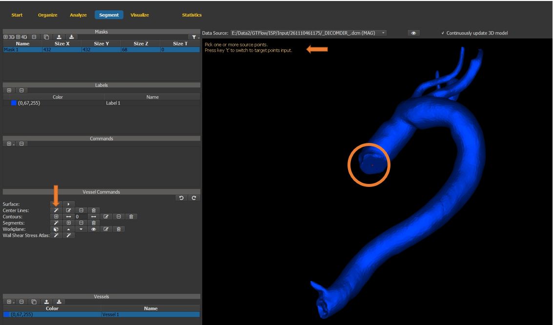
Figure 4.28: Particles statistics tutorial step 9.
4.7.10. Generate the vessel center-line (cont.)
set the end point of the vessel center line.
press the middle mouse button to generate the center line and exit the wizard.
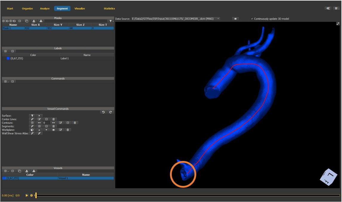
Figure 4.29: Particles statistics tutorial step 10.
4.7.11. Generate vessel contours
select the create contour button in the vessel commands.
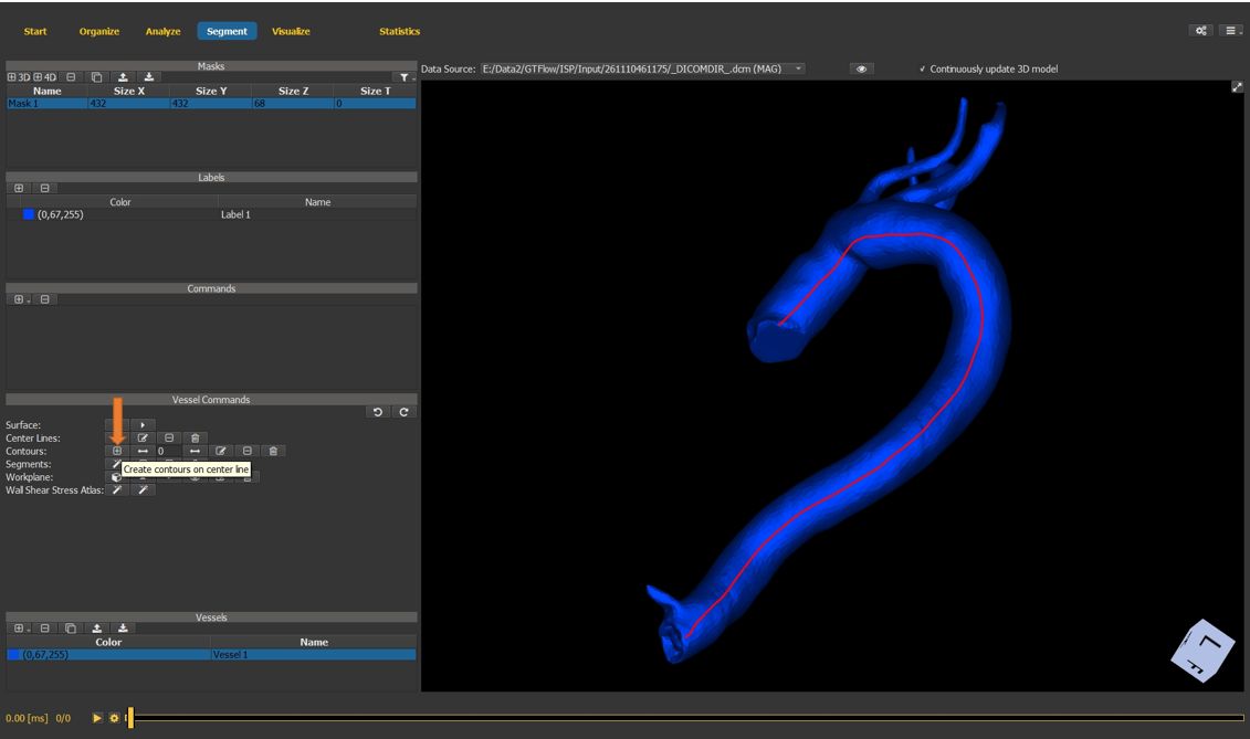
Figure 4.30: Particles statistics tutorial step 11.
4.7.12. Generate vessel contours (cont.)
Left-click on the center-lines to generate contours.
press the middle mouse button to exit the contour creation mode
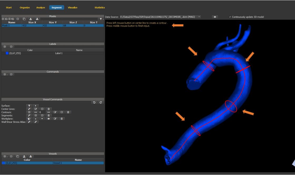
Figure 4.31: Particles statistics tutorial step 12.
4.7.13. Generate vessel segments
Use the segment generation wizard to auto-generate vessel segments in-between the vessel contours.

Figure 4.32: Particles statistics tutorial step 13.
4.7.14. Final segmentation result
Segments are visualized with individual colors. Statistics will be generated both for the entire vessel and for the individual segments.
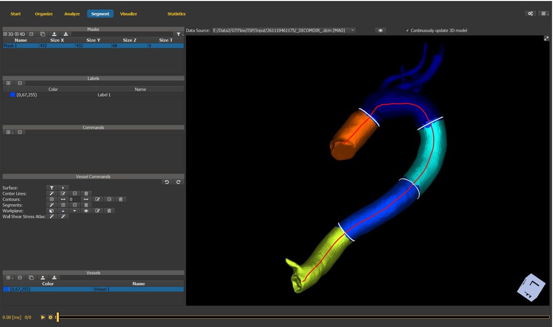
Figure 4.33: Particles statistics tutorial step 14.
4.7.15. Vessel scene node
Switch to the visualize page and generate a new vessel scene node.
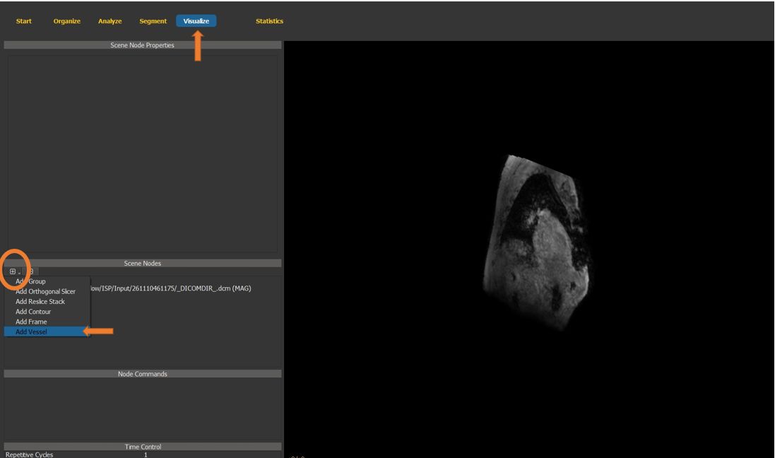
Figure 4.34: Particles statistics tutorial step 15.
4.7.16. Generate path lines
Select the first contour in the newly generated vessel scene node.
In the scene node properties window, switch to the path lines tab.
Set “show path lines” to “true” and generate the path lines.
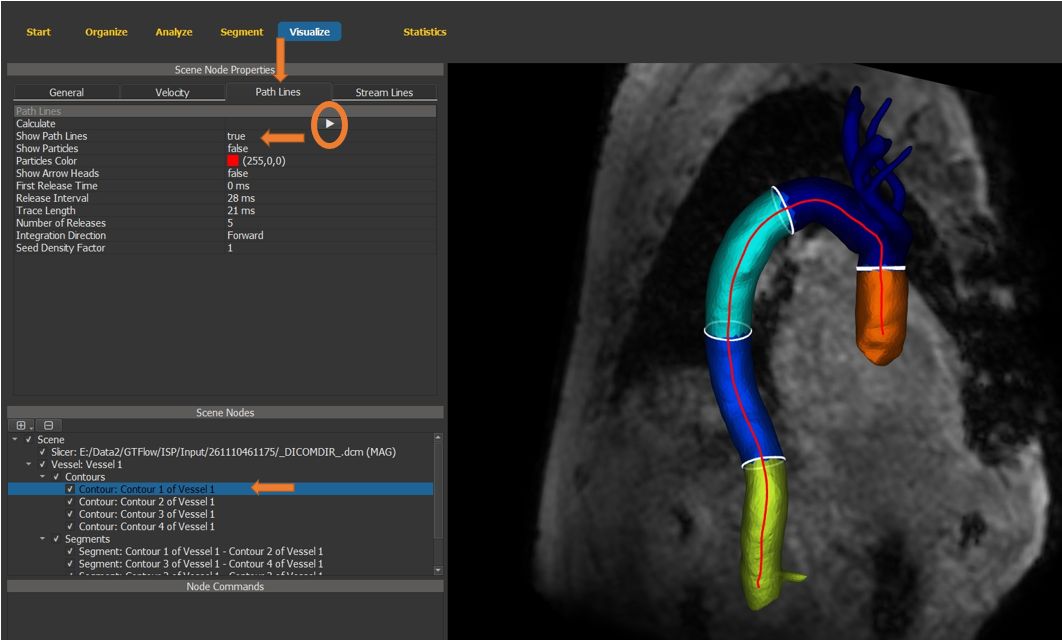
Figure 4.35: Particles statistics tutorial step 16.
4.7.17. Visualize path lines and particles
Use the time slider to visualize path lines.
Enable particle display. (Make sure the same contour scene node is still selected)
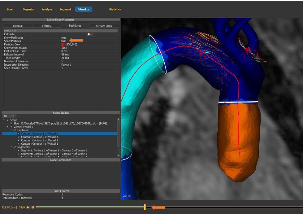
Figure 4.36: Particles statistics tutorial step 17.
4.7.18. Fine-tune visualization
Hide the segments by unchecking the visibility flag on the segments scene node container.
Select the vessel scene node.
On the “general” properties tab, reduce the surface opacity for a better view of particles and path lines.
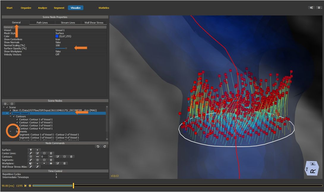
Figure 4.37: Particles statistics tutorial step 18.
4.7.19. Particle statistics window
Open the statistics window and select the particles statistics tab.
The statistics window displays “emitter” contours and segments in the upper table, and “target” contour and segments in the middle table.
Select one emitter and at least one target object to generate particle statistics.
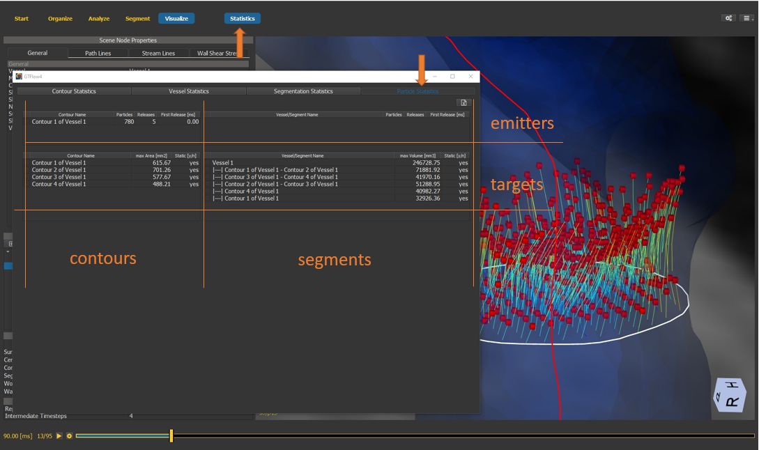
Figure 4.38: Particles statistics tutorial step 19.
4.7.20. Particle statistics
In the result table, all emitted particles are listed (grouped by time emitted). The number of arrivals in the target region, the average arrival time, the average time travelled, the number of departures from the target region and the average transit time are displayed.
By selecting one row of the result table, the detail table is populated with arrival statistics at each individual heart phase.
By selecting a column in the detail statistics table, a time plot is generated.
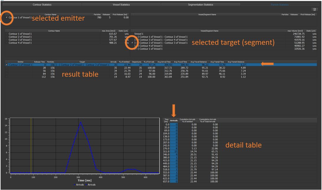
Figure 4.39: Particles statistics tutorial step 20.
4.8. Exploring Statistics
The Statistics Page is a floating panel accessible from the main toolbar at any time. It provides four tabs corresponding to different analysis source types.
4.8.1. Contour Flow and Velocity Statistics

Figure 4.40: Contour flow statistics with time-resolved plot.
Open the Statistics page and select the Contour Statistics tab.
From the Statistics Category dropdown, choose Flow or Velocity.
The upper table lists all defined contours with aggregate values (e.g., net flow, peak velocity) across all heart phases.
Left-click any row to select a contour — the lower table populates with time-resolved values, one row per heart phase.
Left-click one or more column headers in the lower table to plot those values over time in the diagram on the left.
To overlay data from a second contour, tick the checkbox at the far left of its row in the upper table.
Use the Export button to save the displayed table as a CSV file.
4.8.2. Vessel and Pulse Wave Statistics

Figure 4.41: Vessel velocity statistics.
Select the Vessel Statistics tab and choose a category.
Velocity — the upper table shows one row per vessel with peak and mean velocity. The lower table shows time-resolved values per segment.
Wall Shear Stress — only available after WSS has been calculated (see Assessing Wall Shear Stress). Shows mean and maximum WSS per vessel and per segment.

Figure 4.42: Pulse wave velocity analysis.
Pulse Wave — calculates pulse wave velocity (PWV) between vessel segments. Requires:
A vessel with a center line.
At least two vessel-bound contour objects defining segment boundaries.
Use the automatic segment creation mode to ensure segments span the full center line.
The result shows the transit time of the pressure wave between segment pairs and the derived PWV in m/s.
4.8.3. Segmentation Statistics

Figure 4.43: Segmentation statistics.
Select the Segmentation Statistics tab.
Choose a mask and label from the dropdowns.
Select Velocity to compute the mean, peak, and net velocity integrated over all voxels inside the label.
Select Generic to compute statistics of any loaded dataset (e.g., MR angiography signal intensity) inside the label volume.
4.9. Creating Movies and Animations
GTFlow can export two types of videos from the Visualize Page:
Cardiac cycle animation — loops through all heart phases of the loaded flow dataset, capturing the 3D scene at each time point.
Keyframe animation — interpolates the camera position, scene node visibility, and other properties between user-defined keyframes to produce a flythrough or transition animation.
4.9.1. Cardiac Cycle Animation
Switch to the Visualize Page and configure the scene (add slice nodes, vessel nodes, path line nodes, etc.).
Click the Create Movie () button on the main toolbar.
In the movie settings dialog, select Cardiac Cycle mode, set the output resolution and frame rate, and choose a file path.
Click Record — GTFlow will step through each heart phase and render a frame.
4.9.2. Keyframe Animation

Figure 4.44: The keyframe timeline editor at the bottom of the Visualize Page.
The keyframe timeline is displayed at the bottom of the Visualize Page. Each column in the timeline represents one keyframe.
Orient the 3D scene and configure node visibility for the first state.
Click + in the keyframe bar to add a keyframe at the current position. The scene state is captured.
Move to a later position on the timeline, adjust the scene (camera, visibility, etc.), and add another keyframe.
Repeat to build the full animation sequence.
Press the Preview button to play back the interpolated animation in the viewer.
Click Create Movie () on the toolbar and select Keyframe Animation mode.

Figure 4.45: Movie export settings dialog.
Set the output resolution, frame rate, and file path, then click Record.
Tip
Use the Snapshot () button on the toolbar to capture the current view as a single high-resolution PNG image without recording a video.
4.10. Data Export Options in GTFlow
There are multiple options for exporting data from GTFlow.
4.10.1. Exporting velocity field values
1. The velocity field in the spatial resolution of the original dataset can be exported as Matlab .mat-file or as binary data from the Flow Dataset tab on the Organize page. The binary data consists of single-precision float values (4 bytes) of the x, y, and z components of the velocity vector in each pixel. The exported velocities are as in the current state of GTFlow, that is scaled, cropped, and masked. A json text file is exported along the binary files and includes dimension sizes, orientation matrix, offcenter, and voxel sizes.
Figure 4.46: Exporting the full velocity field.
The resampled velocities of any reslice stack can be exported from the Reslice Stacks tab on the Analyze page.
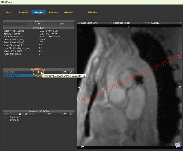
Figure 4.47: Exporting the velocities of a reslice stack.
3. The resampled velocities inside a contour can be exported from the Contours tab on the Analyze page. The velocities are stored as comma separated values in a .csv text file. The spatial and temporal coordinates as well as the x, y, and z components of the velocities are stored in a table for each pixel inside the contour.
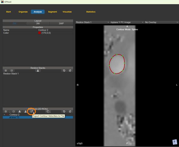
Figure 4.48: Exporting the velocities inside a contour.
4.10.2. Exporting the contours
Contours can be exported and imported in GTFlow. The json file format is used and includes the contour geometry in patient coordinates. Use the export and import buttons on the Contours tab (Analyze page).
4.10.3. Exporting analysis values
Values from the tables on the Statistics window can be stored as comma separated values in .csv text files. The export button is on the Statistics page. The exported values in general correspond to the tables displayed in GTFlow, but they are aggregated or summarized when useful.